Japanese typographic town logos
Pink Tentacle has a fantastic collection of Japanese town logos that work as typographic puzzles on more than one level. I've only put up a few of my favourites here, but the full post, with all the other images, is at this link.
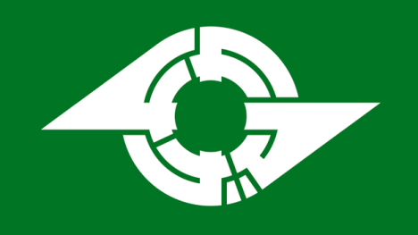
[Typographic logo for Kamagaya (Chiba) spells town name in katakana]
Japanese town logos — official symbols designed to communicate the identity of each municipality — come in a vast array of shapes and colors. Many of these municipal symbols incorporate typographical elements (particularly kanji, hiragana, katakana, and Roman letters) into their designs. In most cases, the stylized characters are straightforward and easy to spot (even if you don’t read Japanese), but sometimes you have to bend your eyes to see them. The more complex logos encode the name of the town into a puzzle-like symbol that begs to be deciphered. Here are a few typographic town logos that make clever use of hiragana and katakana characters. (The examples are arranged in Japanese alphabetical order and include a mixture of both alphabets.)
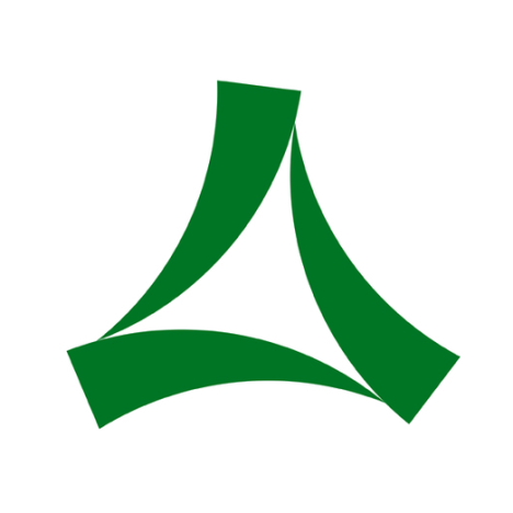
[Minoo, Osaka]
No: Minoo’s picture-puzzle logo consists of three (mi) katakana ノ (no).
* * * * *
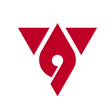
[Hadano, Kanagawa]
Ha: The logo for Hadano consists of the katakana ハタノ (hatano) drawn to resemble wings. ダ (da) is a variant of タ (ta).
* * * * *
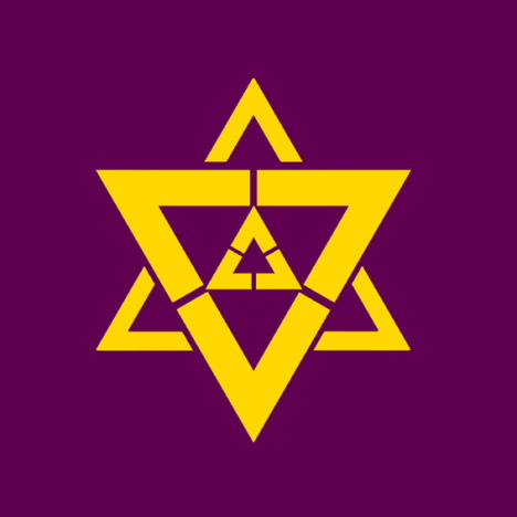
[Fukuchiyama]
Fu: The picture-puzzle logo for Fukuchiyama incorporates nine (ku) katakana フ (fu).
* * * * *
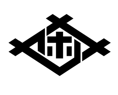
[Sasebo, Nagasaki]
Ho: Sasebo’s logo is drawn with the katakana サセホ (Saseho). ボ (bo) is a variant of ホ (ho).
* * * * *
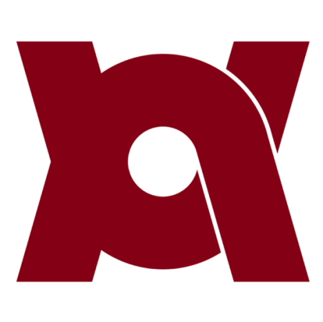
[Kameoka, Kyoto]
Me: Kameoka’s logo design is said to incorporate letters from three alphabets, including the hiragana かめ (kame), the katakana カメ (kame), the roman letters KA, and others.
* * * * *
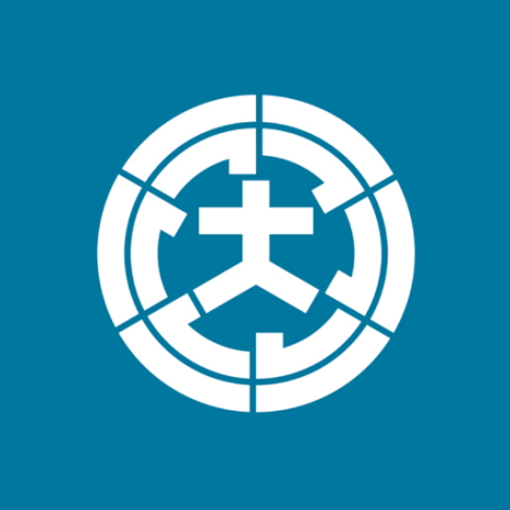
[Omura, Nagasaki]
Ra: Omura’s picture-puzzle logo features the kanji 大 (ō) surrounded by six (mu) katakana ラ (ra).
* * * * *
[More]