Posts in Uncategorized
30 Dumb Inventions

LIFEembedDrawGallery(25371);

From Life: The 20th century saw many astounding technological innovations. The automobile revolutionized the way people live and work, the internet changed the way people think about information, and the U.S. of A put a man on the moon. But some technological advances that came in the earlier part of the 20th centry weren't exactly meant for the history books. Because they were stupid. Take, for example...

Illustrated news from the New York Tribune

Amazingly happy with this find from Flickr, well worth clicking the link to explore the full set. It includes everything from what they think a shipwreck will look like when people are flying between Europe and the US to pictures of Uncle Sam's latest ironclad battleship:

Step back in time to see the news as it happened! This set of cover pages from the New York Tribune illustrated supplements begins with the year 1909. The pages are derived from the Chronicling America newspaper resource at the Library of Congress. To read the small text letters, just click the persistent URL to reach a zoomable version of the page.

Daily newspapers began to feature pictorial sections in the late 1800s when they competed for readers by offering more investigative exposés, illustrations, and cartoons. In the 1890s, William Randolph Hearst and Joseph Pulitzer tapped into new photoengraving techniques to publish halftone photographs, and other newspapers soon adopted the practice. The heavily illustrated supplement sections became the most widely read sections of the papers and provided a great opportunity to attract new customers. The daily life, art, entertainment, politics, and world events displayed in their pages captured the imagination of a curious public.

For more information or to ask a question about these newspapers in Flickr, please visit the National Digital Newspaper Program Web site or the Newspapers and Current Periodicals Reading Room Web site at the Library of Congress.

The perfect breakfast

Stumbled on this excellent post (reproduced below) from 2003. Seems the fellas behind the site had made a stab at a Gentleman's Dictionary and, rather sadly, lost their head of steam. There are some goodies still on there though, including this little gem. As for the breakfast recipe, I'm not sure I've ever poached sausages in oil, but the general style seems about right:

wet boots

Breakfast

You may think that a fried breakfast is something that doesn't need a recipe but I guarantee that if you follow this one you'll never regret it.

1. Wake up in a Georgian country house with a hangover of biblical proportions. Slide your arm from beneath the slender alabaster neck of the recumbent debutante and silently pick your way through the detritus of last night's party to the kitchen.

2. As soft golden sunlight arcs low across the paddock and gilds the chromework of the Aga like melted butter, find a big pan.

3. Heat an unconscionable quantity of oil to a gentle simmer and slip in the freshly made local sausages. Sausages should not be pricked and never fried. The intention is that they should poach in the oil.

4. As the sausages poach make tea. If it is a proper farmhouse there will be a gigantic 'Brown Betty' teapot of the type used to fortify British battalions throughout the last Great Unpleasantness. Add a spoonful of leaf tea (need we mention the sordid subject of bags?) for each person and 'one for the pot'. At this point the kettle will start its song, beginning the process of gently awakening the recovering partygoers. Pour the water over the leaves. The tea serves the same purpose to a hungover Englishman that chicken soup serves to a Jewish New Yorker with a head cold and hives. This is not cooking...it's an emergency clinical intervention. An Englishman's mother will offer him tea as first response medical aid even if his arm has been severed by a combine harvester.

5. Move the sausages to the warming oven, pour off all but a light glazing of the oil and begin to brown the bacon. Much has been written about good bacon and I do not propose to repeat it. Suffice it to say...smoked...streaky...thin...crisp. Place in the warming oven when done.

6. Open a can of Heinz baked beans - accept no substitute - these are not so much a foodstuff as an architectural element of the finished plate. Think of beans as colour and a concealer of disheartening flashes of empty plate between meats.

7. Mushrooms and tomatoes may be grilled at this stage but no gentleman would consider eating them. They are vegetables. Vegetables are a form of table decoration. They aren't food - they go next to food. As the great Dr Johnson should have said 'Vegetables are what food eats' and I have no intention of disagreeing.

8. Americans eat hash browns at breakfast. They are disagreeable to an Englishman. I understand that the French, who can make food out of almost anything, use them to sole espadrilles.

9. There are many different ways to cook eggs but most of them are purely of interest to invalids, children and the feeble-minded. The correct or 'proper English egg' is fried with lightly browned edges in the fat left over from the bacon. At the last minute, oil is flicked over the top of the yolk to seal it. This dangerous procedure causes the yolk to form a perfect, golden, viscid capsule, the violation of which with a rough shard of toast, is the nearest that an Englishman will permit himself to unbridled sexual ecstasy.

10. While the eggs are being coaxed into tumescence the first of the walking wounded will have arrived in the kitchen. Ignore the bashful looks and tousled hair and administer tea in large quantities. Mugs enable fingers to thaw and many a tryst has been sealed by a coy glance over the chipped china rim. The more robust may be set to the simple task of toast.

11. Working quickly, lay down toast, top with an egg, flank with bacon and sausage and fill the spaces with beans. Serve forth.

Quotations (updated)

"My heart is like
A squeezed grape
Only the pip
Is left.
Only the pip."
J.P. Donleavy, The Ginger Man

"I, not events, have the power to make me happy or unhappy today. I can choose which it shall be. Yesterday is dead, tomorrow hasn't arrived yet. I have just one day, today, and I'm going to be happy in it."
Groucho Marx

"What are you doing, growing that beard?"
"I'm not doing a thing; you're shaving every day."
J.P. Donleavy, The Unexpurgated Code

"Vices are like genitals - most are ugly to behold, and yet we find that our own are dear to us." From The Glass Books of the Dream Eaters.

"I am no longer sure of anything. If I satiate my desires, I sin but I deliver myself from them; if I refuse to satisfy them, they infect the whole soul."
Jean-Paul Sartre

"Hold me like a baby!" James Warner

"We must remain fools at all cost." Norman Mailer.

"All paid jobs absorb and degrade the mind." Aristotle.

"I haven't failed, I've found 10,000 ways that don't work."
Thomas Edison.

"Information is not knowledge." Albert Einstein.

"Experience is not what happens to you. It is what you do with what happens to you." Aldous Huxley.

“What makes me depressed? Seeing stupid people happy." Slavoj Zizek.

"There's only three things
That's for sure
Taxes, death and trouble." Marvin Gaye

"All that glisters is not gold;
Often have you heard that told.
Many a man his life hath sold
But my outside to behold.
Gilded tombs do worms enfold."
Shakespeare (Merchant of Venice)

"So much to do, so little point." Adam Buxton

"A lost battle is a battle one thinks one has lost."
Jean-Paul Sartre

"There are two types of poor people, those who are poor together and those who are poor alone. The first are the true poor, the others are rich people out of luck."
Jean-Paul Sartre

"There is only one day left, always starting over: it is given to us at dawn and taken away from us at dusk."
Jean-Paul Sartre

Cat has a bruise on her elbow. "You should put some arnica on it," I say.
"Why, what would that do?" she asks.
"It helps when you've got bruising."
"I thought it was for swelling."
"That's what bruises are."
"Oh."

“I was never one to patiently pick up broken fragments and glue them together again and tell myself that the mended whole was as good as new. What is broken is broken - and I'd rather remember it as it was at its best than mend it and see the broken places as long as I lived.”
Margaret Mitchell

“Five years ago I had a plan to straighten myself out. Here I am, thousands of dollars later with one more insight. That you grow older faster staying in the same place.”
J.P. Donleavy

Friday vids (just the two)

Marvel at this:
[youtube=http://www.youtube.com/watch?v=zCSQPnGkt78&color1=0xb1b1b1&color2=0xcfcfcf&hl=en&feature=player_embedded&fs=1]
(nothing like a good old-fashioned acoustic cover of a rock 'n roll classic)

Japanese typographic town logos

Pink Tentacle has a fantastic collection of Japanese town logos that work as typographic puzzles on more than one level. I've only put up a few of my favourites here, but the full post, with all the other images, is at this link.

Municipal flag, Japan --
[Typographic logo for Kamagaya (Chiba) spells town name in katakana]

Japanese town logos — official symbols designed to communicate the identity of each municipality — come in a vast array of shapes and colors. Many of these municipal symbols incorporate typographical elements (particularly kanji, hiragana, katakana, and Roman letters) into their designs. In most cases, the stylized characters are straightforward and easy to spot (even if you don’t read Japanese), but sometimes you have to bend your eyes to see them. The more complex logos encode the name of the town into a puzzle-like symbol that begs to be deciphered. Here are a few typographic town logos that make clever use of hiragana and katakana characters. (The examples are arranged in Japanese alphabetical order and include a mixture of both alphabets.)

Municipal flag, Japan --
[Minoo, Osaka]

No: Minoo’s picture-puzzle logo consists of three (mi) katakana ノ (no).

* * * * *

Municipal flag, Japan --
[Hadano, Kanagawa]

Ha: The logo for Hadano consists of the katakana ハタノ (hatano) drawn to resemble wings. ダ (da) is a variant of タ (ta).

* * * * *

Municipal flag, Japan --
[Fukuchiyama]

Fu: The picture-puzzle logo for Fukuchiyama incorporates nine (ku) katakana フ (fu).

* * * * *

Municipal flag, Japan --
[Sasebo, Nagasaki]

Ho: Sasebo’s logo is drawn with the katakana サセホ (Saseho). ボ (bo) is a variant of ホ (ho).

* * * * *

Municipal flag, Japan --
[Kameoka, Kyoto]

Me: Kameoka’s logo design is said to incorporate letters from three alphabets, including the hiragana かめ (kame), the katakana カメ (kame), the roman letters KA, and others.

* * * * *

Municipal flag, Japan --
[Omura, Nagasaki]

Ra: Omura’s picture-puzzle logo features the kanji 大 (ō) surrounded by six (mu) katakana ラ (ra).

* * * * *

[More]

RFID touches not

London design firm Berg (formerly Schulz and Webb) is working on a series of provocative videos exploring "designerly applications for RFID." The first one is this lovely Rube Goldberg machine running on RFID: "With RFID it's proximity that matters, and actual contact isn't necessary. Much of Timo's work in the Touch project addresses the fictions and speculations in the technology. Here we play with the problems of invisibility and the magic of being close."

Nearness from timo on Vimeo.

Nearness


Spotted by Cory at Boingboing (and then pinched by me).

Clever designs
The dude at Pink Tentacle wrote this up after spotting some goodies at the Good Design Expo in Tokyo. The meat detector is amazing:

Good Design Expo 2009, Tokyo --

Freshness label [+]

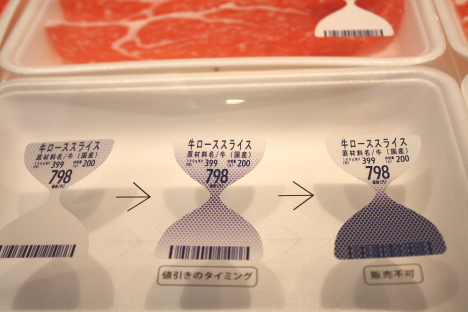
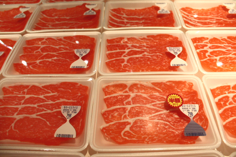
One the most interesting items was this hourglass-shaped freshness label for meat products (designed by TO-GENKYO). The label contains special ink that changes color based on the amount of ammonia emitted by the meat (the older the meat, the more ammonia it releases).

Good Design Expo 2009, Tokyo --

Freshness label [+]

Like an hourglass, the bottom half of the label “fills up” as the meat ages. Consumers can judge the product’s freshness at a glance.

Good Design Expo 2009, Tokyo --

Freshness label (with 1/2 price tag) [+]

When the meat is no longer suitable for sale, the ink blocks the barcode at the bottom so that it cannot be scanned at the cash register.

Good Design Expo 2009, Tokyo --

Hana-Akari [+]

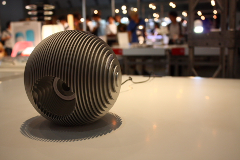
These stylish Hana-Akari interior lamp shades by Sony are actually dye-sensitized solar cells that mimic photosynthesis by storing energy in a thin membrane. The shades collect sunlight during the day and power the lamp at night.

Good Design Expo 2009, Tokyo --

“Concent” USB hub that looks like wall outlet (by ELECOM) [+]

Good Design Expo 2009, Tokyo --

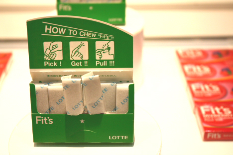
Lotte “Fit’s” gum package [+]

Good Design Expo 2009, Tokyo --

LED desk lamp [+]

Good Design Expo 2009, Tokyo --

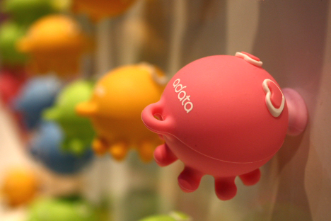
Kissing Octopus Couple USB flash drives [+]

The magnetized mouths of these Kissing Octopus Couple USB flash drives (by A-Data) allow them to function as magnetic stickers when not plugged into a computer. The USB connector tucks neatly inside the body.

Good Design Expo 2009, Tokyo --

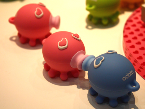
Kissing Octopus Couple USB flash drives [+]

When two are placed face to face, they lock together in a magnetic kiss (making them an ideal gift for Valentine’s Day).

Good Design Expo 2009, Tokyo --

Restroom Item 01 urinals by Toto [+]

Good Design Expo 2009, Tokyo --

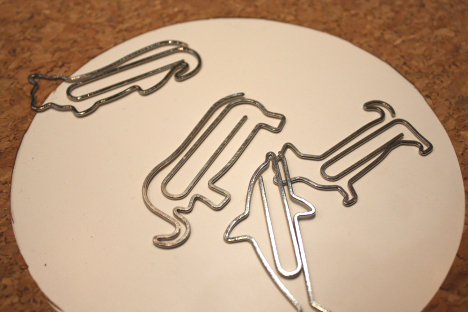
D-Clips (animal-shaped paperclips by Designphil) [+]

Good Design Expo 2009, Tokyo --

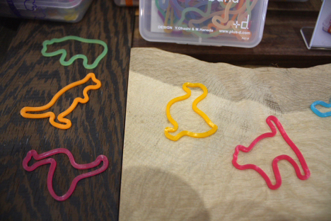
Animal rubber bands (by +d.) [+]

Good Design Expo 2009, Tokyo -- Good Design Expo 2009, Tokyo --

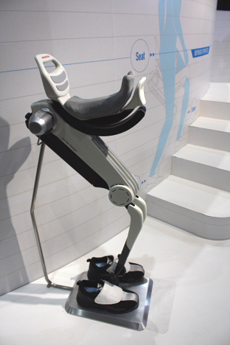
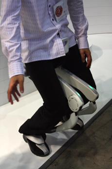
Honda Walking Assist Device [+] [+]

Honda’s experimental Walking Assist Device helps support the wearer’s body weight, reducing the load on the legs while walking, going up and down stairs, and crouching.

Good Design Expo 2009, Tokyo --

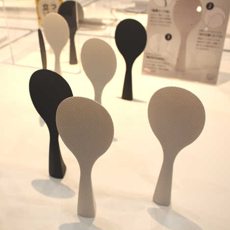
Rice spoons that stand on end [+]

Good Design Expo 2009, Tokyo --

Disposable AED pads [+]

These disposable pads are designed for use with automated external defibrillators (AEDs) placed in public areas. The imprinted design shows where to attach the pads to the body — helpful information for the first-time user.

Good Design Expo 2009, Tokyo --
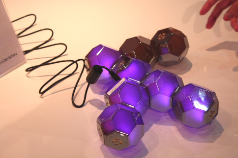
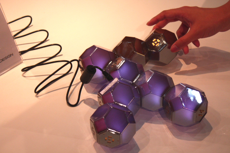
QLD-101 table lamp [+]

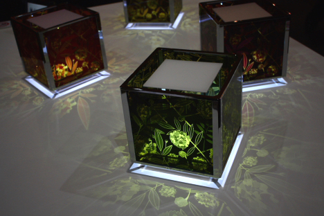
The QLD-101 table lamp (designed by Qisda Corporation) is a modular LED light fixture composed of crystal-like units that connect together with magnets. The polyhedral units can be easily configured into a variety of shapes, and the low-temperature LEDs prevent them from becoming hot to the touch.

Good Design Expo 2009, Tokyo --

QLD-101 table lamp [+]

The interactive lamp, whose design was inspired by natural crystals, gently cycles through a spectrum of colors.

Micro-Questionnaire: Vanessa Dualib

This was on the Spike Jonze's mates / Where The Wild Things Are team blog, We Love You So. It's really very cool. Celebrating anthropomorphic vegetables in a way that doesn't involve just finding carrots and potatoes that resemble genitalia. Enjoy! 3258223292_01fc110f3f_b

A few weeks ago we featured the inimitable Edith Zimmerman as an examplar of high-concept food trickery. Well, it turns out there’s more than one way to impart human characteristics onto vegetables!

Meet Vanessa Dualib, a 29 year-old Brazilian artist and photographer living and working in São Paulo. Her book, “Playing With Food”, documents the mind-expanding convergence of her three favorite things: food, photography, and humor. Get a comprehensive preview at Vanessa’s Flickr page, and read on for a micro-questionnaire.

Picture 5

Hey Vanessa! What do you like about working with food?

The possibilities! Truly. They are absolutely endless! I honestly tell people that there are some fruits and veggies in this world that are ‘born’ to be something else. It’s not really how I look at them, but more of how they look at me.

Do you work in other media too?

Currently I am focusing on photography– I still have a lot to learn. And most important of all, I’m still trying to convince my mom that what I do can be considered a form of art. The last time she saw me photographing one of my creations she looked at me with that familiar disapproving look and said “I sure hope you plan on eating that once you’re done playing with it…”

Yes, mom. I will.

Have you read “Where The Wild Things Are”?

I was pretty young when I first read Sendak’s book and it was totally different from anything else I had ever seen or read. The illustrations blew my mind and there was also this other ‘thing’ about this book, something that only later on my life I could define better. And that was actually that for me the essence of WTWTA lies in the genuine ability of the book to portray the feelings and fears of a child…

What are your favorite foods to work with?

Fruits and veggies. Any kind. I got a soft spot for eggs too. By now all my friends are very likely getting nervous when they invite me to lunch or dinner at a public place… probably thinking “Oh my… if she makes the olives talk to the waiter again I’m never going to invite her for lunch ever again!!”

Picture 6

Placebos Are Getting More Effective. Drugmakers Are Desperate to Know Why.

Extract from WIRED:

Merck was in trouble. In 2002, the pharmaceutical giant was falling behind its rivals in sales. Even worse, patents on five blockbuster drugs were about to expire, which would allow cheaper generics to flood the market. The company hadn't introduced a truly new product in three years, and its stock price was plummeting.

In interviews with the press, Edward Scolnick, Merck's research director, laid out his battle plan to restore the firm to preeminence. Key to his strategy was expanding the company's reach into the antidepressant market, where Merck had lagged while competitors like Pfizer and GlaxoSmithKline created some of the best-selling drugs in the world. "To remain dominant in the future," he told Forbes, "we need to dominate the central nervous system."

His plan hinged on the success of an experimental antidepressant codenamed MK-869. Still in clinical trials, it looked like every pharma executive's dream: a new kind of medication that exploited brain chemistry in innovative ways to promote feelings of well-being. The drug tested brilliantly early on, with minimal side effects, and Merck touted its game-changing potential at a meeting of 300 securities analysts.

Behind the scenes, however, MK-869 was starting to unravel. True, many test subjects treated with the medication felt their hopelessness and anxiety lift. But so did nearly the same number who took a placebo, a look-alike pill made of milk sugar or another inert substance given to groups of volunteers in clinical trials to gauge how much more effective the real drug is by comparison. The fact that taking a faux drug can powerfully improve some people's health—the so-called placebo effect—has long been considered an embarrassment to the serious practice of pharmacology.

Ultimately, Merck's foray into the antidepressant market failed. In subsequent tests, MK-869 turned out to be no more effective than a placebo. In the jargon of the industry, the trials crossed the futility boundary.

MK-869 wasn't the only highly anticipated medical breakthrough to be undone in recent years by the placebo effect. From 2001 to 2006, the percentage of new products cut from development after Phase II clinical trials, when drugs are first tested against placebo, rose by 20 percent. The failure rate in more extensive Phase III trials increased by 11 percent, mainly due to surprisingly poor showings against placebo. Despite historic levels of industry investment in R&D, the US Food and Drug Administration approved only 19 first-of-their-kind remedies in 2007—the fewest since 1983—and just 24 in 2008. Half of all drugs that fail in late-stage trials drop out of the pipeline due to their inability to beat sugar pills.

The upshot is fewer new medicines available to ailing patients and more financial woes for the beleaguered pharmaceutical industry. Last November, a new type of gene therapy for Parkinson's disease, championed by the Michael J. Fox Foundation, was abruptly withdrawn from Phase II trials after unexpectedly tanking against placebo. A stem-cell startup called Osiris Therapeutics got a drubbing on Wall Street in March, when it suspended trials of its pill for Crohn's disease, an intestinal ailment, citing an "unusually high" response to placebo. Two days later, Eli Lilly broke off testing of a much-touted new drug for schizophrenia when volunteers showed double the expected level of placebo response.

It's not only trials of new drugs that are crossing the futility boundary. Some products that have been on the market for decades, like Prozac, are faltering in more recent follow-up tests. In many cases, these are the compounds that, in the late '90s, made Big Pharma more profitable than Big Oil. But if these same drugs were vetted now, the FDA might not approve some of them. Two comprehensive analyses of antidepressant trials have uncovered a dramatic increase in placebo response since the 1980s. One estimated that the so-called effect size (a measure of statistical significance) in placebo groups had nearly doubled over that time.

It's not that the old meds are getting weaker, drug developers say. It's as if the placebo effect is somehow getting stronger.

The fact that an increasing number of medications are unable to beat sugar pills has thrown the industry into crisis. The stakes could hardly be higher. In today's economy, the fate of a long-established company can hang on the outcome of a handful of tests.

Why are inert pills suddenly overwhelming promising new drugs and established medicines alike? The reasons are only just beginning to be understood. A network of independent researchers is doggedly uncovering the inner workings—and potential therapeutic applications—of the placebo effect. At the same time, drugmakers are realizing they need to fully understand the mechanisms behind it so they can design trials that differentiate more clearly between the beneficial effects of their products and the body's innate ability to heal itself. A special task force of the Foundation for the National Institutes of Health is seeking to stem the crisis by quietly undertaking one of the most ambitious data-sharing efforts in the history of the drug industry. After decades in the jungles of fringe science, the placebo effect has become the elephant in the boardroom.

Continue reading here.

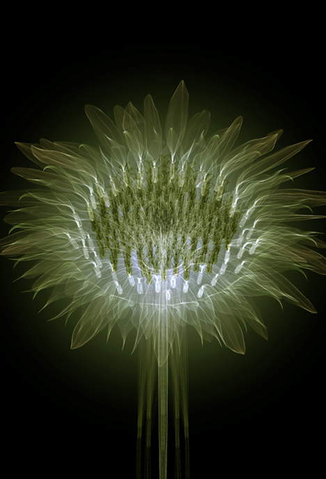
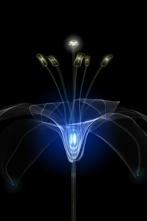
Electric flowers...

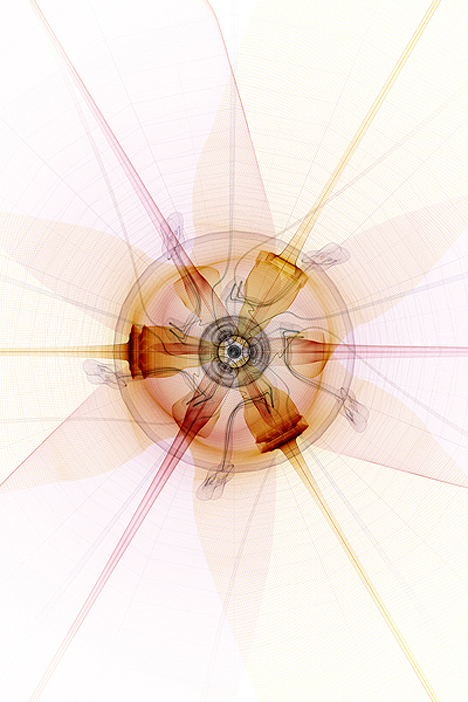
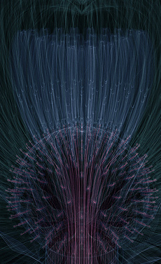
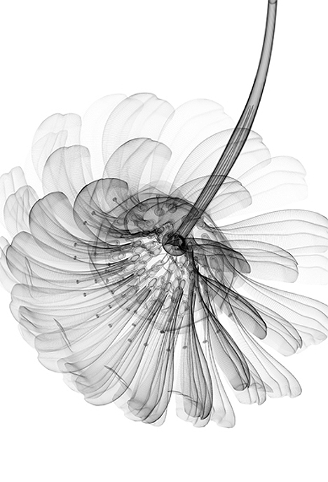
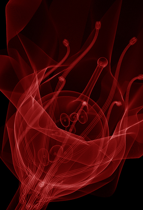
CG illustrator Macoto Murayama takes a unique look at the organic beauty of flowers by highlighting their geometric and mechanical structure. (from pinktentacle.com)

CG illustration by Macoto Murayama --
H. annuus

CG illustration by Macoto Murayama --
H. annuus

CG illustration by Macoto Murayama --
H. annuus

CG illustration by Macoto Murayama --
Lily

CG illustration by Macoto Murayama --
Lily

CG illustration by Macoto Murayama --
Lily

CG illustration by Macoto Murayama --
Lily

CG illustration by Macoto Murayama -- CG illustration by Macoto Murayama --

CG illustration by Macoto Murayama -- CG illustration by Macoto Murayama --
C. morifolium

CG illustration by Macoto Murayama --
Gerbera

CG illustration by Macoto Murayama --
Gerbera

CG illustration by Macoto Murayama --
C. warneri [+]

CG illustration by Macoto Murayama --
C. warneri [+]

CG illustration by Macoto Murayama --
Rosa [+]

CG illustration by Macoto Murayama --
Prunus