Posts in Uncategorized
Flickr sets from Original-Linkage

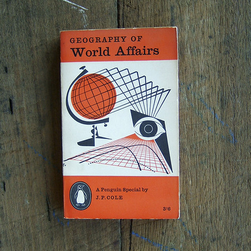
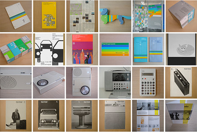
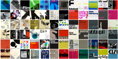
Bob Sakoui, that lovely doyen of design, posted this thoroughly nourishing collection of some of his favourite Flickr sets at Original-Linkage:

There are many great flickr collections out there and they do make for great inspiration, so here are a few varied old and new sets that you may have missed...
--------------------------------------------------------------------------------

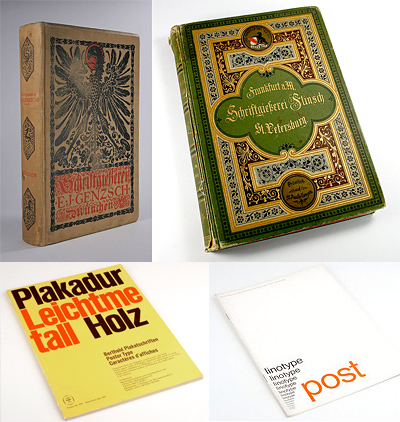
Type Specimen Books by type foundries pre WW2. Collections by Henning Krause.
--------------------------------------------------------------------------------

Here's a pretty good collection of matchbox cover designs.
--------------------------------------------------------------------------------

Worth flicking through ABCVerlag's design book pool.
--------------------------------------------------------------------------------

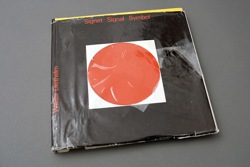
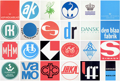
1960’s and 1970’s Scandinavian logo collection by Oliver Tomas
--------------------------------------------------------------------------------

Here's a super graphic design collection from Insect 54.
--------------------------------------------------------------------------------

Many gems to be found in Acejet170's flickr collection.
--------------------------------------------------------------------------------

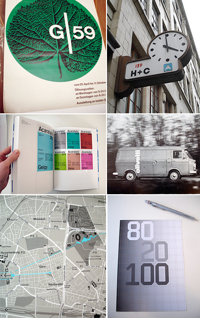
A collection of modernist design by Alphanumeric.
--------------------------------------------------------------------------------

More classic design collections from Ellen McFadden.
--------------------------------------------------------------------------------

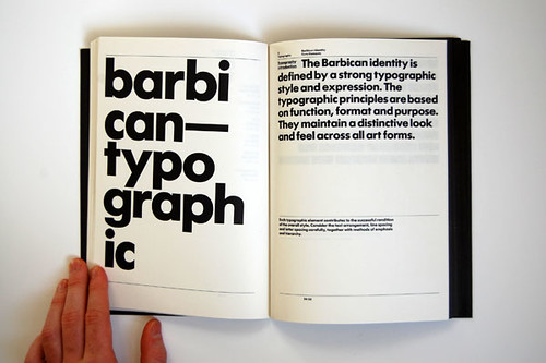
Another nice design collection including scans of The Barbican brand guides by Ajones87.
--------------------------------------------------------------------------------

A ton of type at Typofile's flickr sets.
--------------------------------------------------------------------------------

Also worth looking at the Typography and Lettering pool flickr set.
--------------------------------------------------------------------------------

An extensive collection of Found Type.
--------------------------------------------------------------------------------

Another pool of Vintage Type
--------------------------------------------------------------------------------

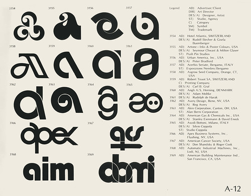
A big selection of vintage logos taken from a 1970’s book called ‘World of Logotypes’.
--------------------------------------------------------------------------------

A collection of assorted graphics by Stéphane Massa-Bidal.
--------------------------------------------------------------------------------

Avant guarde and great, sets from 9000.
--------------------------------------------------------------------------------

Today, Aisleone blog, brings to our attention another rather nice flickr set of vintage ads, which you can see here.
--------------------------------------------------------------------------------

Vintage imagery and type to be found in Agence Eureka's sets.
--------------------------------------------------------------------------------

More vintage imagery fromThe Vintage Collective.
--------------------------------------------------------------------------------

Another rather large and unusual collection of vintage ads by Gatochy.
--------------------------------------------------------------------------------

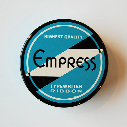
Lovely set of typewriter ribbon case designs from Uppercase.
--------------------------------------------------------------------------------

Of course there are a few more great flickr sites out there, but these should keep you happy for at least the weekend!

Enjoy!

Steven Seagal is being sued for sexual assault, trafficking

TMZ broke the story in the first place.

PIXELS

[youtube=http://www.youtube.com/watch?v=SxX_bVluflo&hl=en_US&fs=1&]
One for the 8-bit old school.

PIXELS is Patrick Jean's latest short film, shot on location in New York. If you're on FB, you'll have to click here to watch it. Best viewed as large as your connection will go.

Written, directed by : Patrick Jean
Director of Photograhy : Matias Boucard
SFX by Patrick Jean and guests
Produced by One More Production

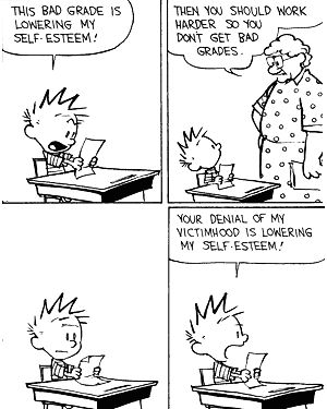
Self-Esteem vs. Self-Respect

Theodore Dalrymple (not his real name) is one of my favourite writers. Utterly rational and fascinating on his recurring themes of ignorance, poverty and so on, he shows without telling and sermonises without preaching, allowing readers to understand what he's trying to say rather than being bombastic and repetitive. Here's the first half of a piece he wrote for In Character. Read the full thing here, it's good.

With the coyness of someone revealing a bizarre sexual taste, my patients would often say to me, "Doctor, I think I'm suffering from low self-esteem." This, they believed, was at the root of their problem, whatever it was, for there is hardly any undesirable behavior or experience that has not been attributed, in the press and on the air, in books and in private conversations, to low self-esteem, from eating too much to mass murder.

Self-esteem is, of course, a term in the modern lexicon of psychobabble, and psychobabble is itself the verbal expression of self-absorption without self-examination. The former is a pleasurable vice, the latter a painful discipline. An accomplished psychobabbler can talk for hours about himself without revealing anything.

Insofar as self-esteem has a meaning, it is the appreciation of one's own worth and importance. That it is a concept of some cultural resonance is demonstrated by the fact that an Internet search I conducted brought up 14,500,000 sites, only slightly fewer than the U.S. Constitution and four times as many as "fortitude."

When people speak of their low self-esteem, they imply two things: first, that it is a physiological fact, rather like low hemoglobin, and second, that they have a right to more of it. What they seek, if you like, is a transfusion of self-esteem, given (curiously enough) by others; and once they have it, the quality of their lives will improve as the night succeeds the day. For the record, I never had a patient who complained of having too much self-esteem, and who therefore asked for a reduction. Self-esteem, it appears, is like money or health: you can't have too much of it.

Self-esteemists, if I may so call those who are concerned with the levels of their own self-esteem, believe that it is something to which they have a right. If they don't have self-esteem in sufficient quantity to bring about a perfectly happy life, their fundamental rights are being violated. They feel aggrieved and let down by others rather than by themselves; they ascribe their lack of rightful self-esteem to the carping, and unjustified, criticism of parents, teachers, spouses, and colleagues.

The twin qualities leading to self-esteem are (an allegedly) just appreciation of one's own importance and of one's own worth. Neither importance nor worth, however, are qualities to be found in nature without an appraising mind; it is the appraising mind that confers them upon their object.

Read the full article here.

So the iPad’s cool and everything, but…

...who remembers the Psion Organiser?

My old French teacher Mr Johnston (a.k.a. Doss Boss) had a Psion II. He used it as a ridiculously large and clunky Filofax. It was better than the Psion I mainly because it had two lines of text to display rather than just one (with only 16 characters). There was quite a kerfuffle when he upgraded it to 32k of RAM. It had one game on it, which was like worms on two lines. It also had a handy slide-off cover to protect it, which was actually slightly curved instead of all pointy - a big change in the aesthetic that made it look less like a calculator. What else...the letters were arranged alphabetically rather than QWERTY, and it cost £139 new.

Awesome vintage advert here.

Scientific American gets an iPad makeover

Based on their great Mag+ concept unveiled late last year, Bonnier and BERG have developed a really nice looking iPad version of Popular Science. No page-turning business...you swipe left/right to page through stories and then scroll to read through single stories.
Mag+ live with Popular Science+ from Bonnier on Vimeo.

What amazes me is that you don't feel like you're using a website, or even that you're using an e-reader on a new tablet device -- which, technically, is what it is. It feels like you're reading a magazine.
(Via)

Russian astronaut’s blog

I think he has landed now, but Maksim Suraev wrote loads of posts from his latest mission in space. They're really quite sweet. Funny to think of someone actually in the International Space Station, whizzing around in the night sky.You can see them here in English (here in Russian, where there are more photos).

Here's an example of one of his posts:
Once upon a time there were two cosmonauts on board the Russian section of the International Space Station. They were living in great comfort, kept their section clean and were doing research.

And there was a greenhouse on board the Station. The cosmonauts were growing lettuce there to give scientists on the earth food for thought.

But apart from lettuce, wheat grew in the greenhouse on its own. And it was so good that all the scientists admired it.


Once, in the morning, Prince Oleg woke up and decided to have some fresh bread for breakfast, to get more strength.

And then Maxim flew past. Oleg asked him: “My dear friend, will you please look for some flour in our section, so that we can bake bread. We can eat it and it will give us strength!”

And Maxim replied: “Why should we look for flour, if we have our own wheat?! And green lettuce too!”

So they ate the lettuce and grew stronger!

Now they no longer fear going into outer space, or on any space-link-up!

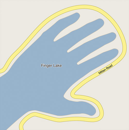
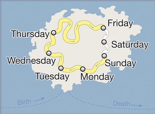
Abstract City – raaaather nice Google Map inspired illos

These illustrations, from a series called Abstract City, are by Christoph Niemann. He has won loads of prizes and done everything from Wired and the New York Times to, well, this stuff. Click here to see loads of his other stuff on the NY Times website (it's worth it if you like it). His website is christophniemann.com. He also has a new book out called "I LEGO N.Y." You should check it out. Maybe buy it. It's on his internets.

Illustrator Christoph Niemann Abstract City Blog Map drawings

Illustrator Christoph Niemann Abstract City Blog Map drawings

Illustrator Christoph Niemann Abstract City Blog Map drawings

Illustrator Christoph Niemann Abstract City Blog Map drawings

Via BOOOOOOOOM!

Easy on the adverbs, exclamation points and especially hooptedoodle

Carrying on the theme from earlier posts, Elmore Leonard wrote these tips up for The New Yorker a few years back. He's an inspiring writer. His rules are bang on.

These are rules I've picked up along the way to help me remain invisible when I'm writing a book, to help me show rather than tell what's taking place in the story. If you have a facility for language and imagery and the sound of your voice pleases you, invisibility is not what you are after, and you can skip the rules. Still, you might look them over.

1. Never open a book with weather.
If it's only to create atmosphere, and not a character's reaction to the weather, you don't want to go on too long. The reader is apt to leaf ahead looking for people. There are exceptions. If you happen to be Barry Lopez, who has more ways to describe ice and snow than an Eskimo, you can do all the weather reporting you want.

2. Avoid prologues.
They can be annoying, especially a prologue following an introduction that comes after a foreword. But these are ordinarily found in nonfiction. A prologue in a novel is backstory, and you can drop it in anywhere you want.

There is a prologue in John Steinbeck's Sweet Thursday, but it's O.K. because a character in the book makes the point of what my rules are all about. He says: ''I like a lot of talk in a book and I don't like to have nobody tell me what the guy that's talking looks like. I want to figure out what he looks like from the way he talks. . . . figure out what the guy's thinking from what he says. I like some description but not too much of that. . . . Sometimes I want a book to break loose with a bunch of hooptedoodle. . . . Spin up some pretty words maybe or sing a little song with language. That's nice. But I wish it was set aside so I don't have to read it. I don't want hooptedoodle to get mixed up with the story.''

3. Never use a verb other than ''said'' to carry dialogue.
The line of dialogue belongs to the character; the verb is the writer sticking his nose in. But said is far less intrusive than grumbled, gasped, cautioned, lied. I once noticed Mary McCarthy ending a line of dialogue with ''she asseverated,'' and had to stop reading to get the dictionary.


4. Never use an adverb to modify the verb ''said'' . . .
. . . he admonished gravely. To use an adverb this way (or almost any way) is a mortal sin. The writer is now exposing himself in earnest, using a word that distracts and can interrupt the rhythm of the exchange. I have a character in one of my books tell how she used to write historical romances ''full of rape and adverbs.''

5. Keep your exclamation points under control.
You are allowed no more than two or three per 100,000 words of prose. If you have the knack of playing with exclaimers the way Tom Wolfe does, you can throw them in by the handful.


6. Never use the words ''suddenly'' or ''all hell broke loose.''
This rule doesn't require an explanation. I have noticed that writers who use ''suddenly'' tend to exercise less control in the application of exclamation points.

7. Use regional dialect, patois, sparingly.
Once you start spelling words in dialogue phonetically and loading the page with apostrophes, you won't be able to stop. Notice the way Annie Proulx captures the flavor of Wyoming voices in her book of short stories Close Range.


8. Avoid detailed descriptions of characters.
Which Steinbeck covered. In Ernest Hemingway's Hills Like White Elephants what do the ''American and the girl with him'' look like? ''She had taken off her hat and put it on the table.'' That's the only reference to a physical description in the story, and yet we see the couple and know them by their tones of voice, with not one adverb in sight.

9. Don't go into great detail describing places and things.
Unless you're Margaret Atwood and can paint scenes with language or write landscapes in the style of Jim Harrison. But even if you're good at it, you don't want descriptions that bring the action, the flow of the story, to a standstill.

And finally:

10. Try to leave out the part that readers tend to skip.
A rule that came to mind in 1983. Think of what you skip reading a novel: thick paragraphs of prose you can see have too many words in them. What the writer is doing, he's writing, perpetrating hooptedoodle, perhaps taking another shot at the weather, or has gone into the character's head, and the reader either knows what the guy's thinking or doesn't care. I'll bet you don't skip dialogue.

My most important rule is one that sums up the 10.
If it sounds like writing, I rewrite it.

Or, if proper usage gets in the way, it may have to go. I can't allow what we learned in English composition to disrupt the sound and rhythm of the narrative. It's my attempt to remain invisible, not distract the reader from the story with obvious writing. (Joseph Conrad said something about words getting in the way of what you want to say.)

If I write in scenes and always from the point of view of a particular character -- the one whose view best brings the scene to life -- I'm able to concentrate on the voices of the characters telling you who they are and how they feel about what they see and what's going on, and I'm nowhere in sight.

What Steinbeck did in Sweet Thursday was title his chapters as an indication, though obscure, of what they cover. ''Whom the Gods Love They Drive Nuts'' is one, ''Lousy Wednesday'' another. The third chapter is titled ''Hooptedoodle 1'' and the 38th chapter ''Hooptedoodle 2'' as warnings to the reader, as if Steinbeck is saying: ''Here's where you'll see me taking flights of fancy with my writing, and it won't get in the way of the story. Skip them if you want.''

Sweet Thursday came out in 1954, when I was just beginning to be published, and I've never forgotten that prologue.

Did I read the hooptedoodle chapters? Every word.

Elmore Leonard's 10 rules have been written up in this beautiful cloth bound book. Buy the book here and give it to me for Christmas. Or my birthday. Thanks.

Ernest Hemingway’s writing tips for bloggers

Ernest Hemingway
“Throughout his career as a writer,” says Larry W. Phillips in Ernest Hemingway on Writing, “Hemingway maintained that it was bad luck to talk about writing.” Nevertheless the tips Phillips condensed into his book would be applicable to good blog writing too:
1. Start with the simplest things
2. Boil it down

3. Know what to leave out
4. Write the tip of the ice-berg, leave the rest under the water
5. Watch what happens today
6. Write what you see
7. Listen completely
8. Write when there is something you know, and not before
9. Look at words as if seeing them for the first time
10. Use the most conventional punctuation you can
11. Ditch the dictionary
12. Distrust adjectives
13. Learn to write a simple declarative sentence
14. Tell a story in six words
15. Write poetry into prose
16. Read everything so you know what you need to beat
17. Don’t try to beat Shakespeare
18. Accept that writing is something you can never do as well as it can be done
19. Go fishing in summer
20. Don’t drink when you’re writing
21. Finish what you start
22. Don’t worry. You’ve written before and you will write again
23. Forget posterity. Think only of writing truly
24. Write as well as you can with no eye on the market
25. Write clearly – and people will know if you are being true
26. Just write the truest sentence that you know
27. Remember that nobody really knows or understands the secret
(Via)

Doob

Bob sez, and he's right:
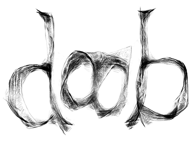
If I were to be honest, there are not that many experimental self generating art projects that really appeal to me, but sometimes it is done so well that I can't help but be impressed. Such is the case with the ultra talented Mr Doob (a.k.a Ricardo Cabello) and his latest project, 'Harmony'. It's a lot of fun - the aesthetic is really quite wonderful also. Love it. Try it yourself here.

(via the amazing Original Linkage)