Posts tagged illustration
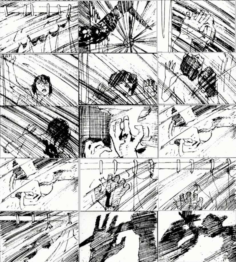
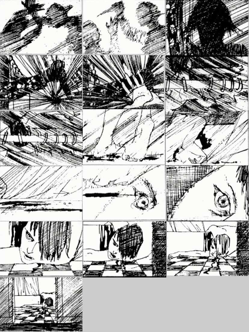
Saul Bass storyboards for Psycho

Amazing. Click to enlarge. Via Potrzebie. psy1

psy2

psy3

  Wikipedia sez:

During his 40-year career Bass worked for some of Hollywood's most prominent filmmakers, including Alfred HitchcockOtto PremingerBilly WilderStanley Kubrick and Martin Scorsese. Among his most famous title sequences are the animated paper cut-out of a heroin addict's arm for Preminger's The Man with the Golden Arm, the credits racing up and down what eventually becomes a high-angle shot of a skyscraper in Hitchcock's North by Northwest, and the disjointed text that races together and apart in Psycho.

Bass designed some of the most iconic corporate logos in North America, including the Bell System logo in 1969, as well as AT&T's globe logo in 1983 after the breakup of the Bell System. He also designed Continental Airlines' 1968 jet stream logo and United Airlines' 1974 tulip logo which became some of the most recognized airline industry logos of the era.

Here's his title sequence for The Man With The Golden Arm, made in 1955: [youtube=http://www.youtube.com/watch?v=sS76whmt5Yc&w=700]

Map of the open country of a woman's heart

By D. W. Kellogg in Retronaut:

‘According to this map, Love is at the center of a woman’s heart, and Sentimentality and Sentiment (including Good Sense, Discrimination, Hope, Enthusiasm, and Platonic Affection) take up a sizeable portion of the entire territory. This region of Sentiment and Sentimentality is separated from the larger, treacherous areas of a woman’s heart: Selfishness and Coquetry pose dangers, especially to gentleman travelers, and these attributes suggest that all women are basically untrustworthy. The largest regions, Love of Admiration, Love of Dress, and Love of Display, all suggest that women are also essentially shallow and frivolous. Although the image claims to have been drawn by “A Lady,” it is just as likely that it proceeded from the imagination of a man.’


- American Antiquarian, via Brain Pickings


Pixar story rules (one version)

Pixar story artist Emma Coats has tweeted a series of “story basics” over the past month and a half — guidelines that she learned from her more senior colleagues on how to create appealing stories: #1: You admire a character for trying more than for their successes.

#2: You gotta keep in mind what’s interesting to you as an audience, not what’s fun to do as a writer. They can be v. different.

#3: Trying for theme is important, but you won’t see what the story is actually about til you’re at the end of it. Now rewrite.

#4: Once upon a time there was ___. Every day, ___. One day ___. Because of that, ___. Because of that, ___. Until finally ___.

#5: Simplify. Focus. Combine characters. Hop over detours. You’ll feel like you’re losing valuable stuff but it sets you free.

#6: What is your character good at, comfortable with? Throw the polar opposite at them. Challenge them. How do they deal?

#7: Come up with your ending before you figure out your middle. Seriously. Endings are hard, get yours working up front.

#8: Finish your story, let go even if it’s not perfect. In an ideal world you have both, but move on. Do better next time.

#9: When you’re stuck, make a list of what WOULDN’T happen next. Lots of times the material to get you unstuck will show up.

#10: Pull apart the stories you like. What you like in them is a part of you; you’ve got to recognize it before you can use it.

#11: Putting it on paper lets you start fixing it. If it stays in your head, a perfect idea, you’ll never share it with anyone. #12: Discount the 1st thing that comes to mind. And the 2nd, 3rd, 4th, 5th – get the obvious out of the way. Surprise yourself.

#13: Give your characters opinions. Passive/malleable might seem likable to you as you write, but it’s poison to the audience.

#14: Why must you tell THIS story? What’s the belief burning within you that your story feeds off of? That’s the heart of it.

#15: If you were your character, in this situation, how would you feel? Honesty lends credibility to unbelievable situations.

#16: What are the stakes? Give us reason to root for the character. What happens if they don’t succeed? Stack the odds against.

#17: No work is ever wasted. If it’s not working, let go and move on - it’ll come back around to be useful later. #18: You have to know yourself: the difference between doing your best & fussing. Story is testing, not refining.

#19: Coincidences to get characters into trouble are great; coincidences to get them out of it are cheating.

#20: Exercise: take the building blocks of a movie you dislike. How d’you rearrange them into what you DO like?

#21: You gotta identify with your situation/characters, can’t just write ‘cool’. What would make YOU act that way?

#22: What’s the essence of your story? Most economical telling of it? If you know that, you can build out from there.

Presumably she’ll have more to come. Also, watch for her personal side project, a science-fiction short called Horizon, to come to a festival near you.

(Via)

The Guy Quote - Lucian Freud

Freud was born in Berlin but his father, Ernst, moved the family to England in 1933 to skip the rise of Nazism. Grandson of Sigmund Freud, elder brother of Clement Freud (who told the world's funniest joke), he seems to have chosen to paint without much fuss or fanfare - it's what he was meant to do. He was one of a group of artists in Britain at the time, the "School of London", which along with Francis Bacon and a few others concentrated on figurative painting. He had a pretty crazy personal life (many lovers, at least 14 kids) - but there's plenty on that elsewhere.

Freud's subjects, who needed to make a very large and uncertain commitment of their time, were often the people in his life; friends, family, fellow painters, lovers, children. He said, "The subject matter is autobiographical, it's all to do with hope and memory and sensuality and involvement, really." However the titles were mostly anonymous, and the identity of the sitter not always disclosed; the Duke and Duchess of Devonshire had a portrait of one of Freud's daughters as a baby for several years before he mentioned who the model was.

In the 1970s Freud spent 4,000 hours on a series of paintings of his mother, about which art historian Lawrence Gowing observed "it is more than 300 years since a painter showed as directly and as visually his relationship with his mother. And that was Rembrandt." For me, the ones of his mum are the most emotive of all. She was in a deep depression at the time as Ernst had died, and you can instantly feel that mood in the room, almost disengaged (he couldn't paint her before because she was too animated and interested in him) as she stares into space.

A prodigious worker, Freud spent a huge amount of time on his paintings, and always needed to have the subject in the room. He'd work in five-hour sessions, and a single painting easily take over two thousand hours to complete. He'd start by drawing in charcoal, then paint a small area of the canvas, and gradually work outward from there. For a new sitter, he often started with the head as a means of "getting to know" the person, then painted the rest of the figure, eventually returning to the head as his comprehension of the model deepened. A section of canvas was intentionally left bare until the painting was finished, as a reminder that the work was in progress. The finished painting is an accumulation of richly worked layers of pigment, as well as months of intense observation.

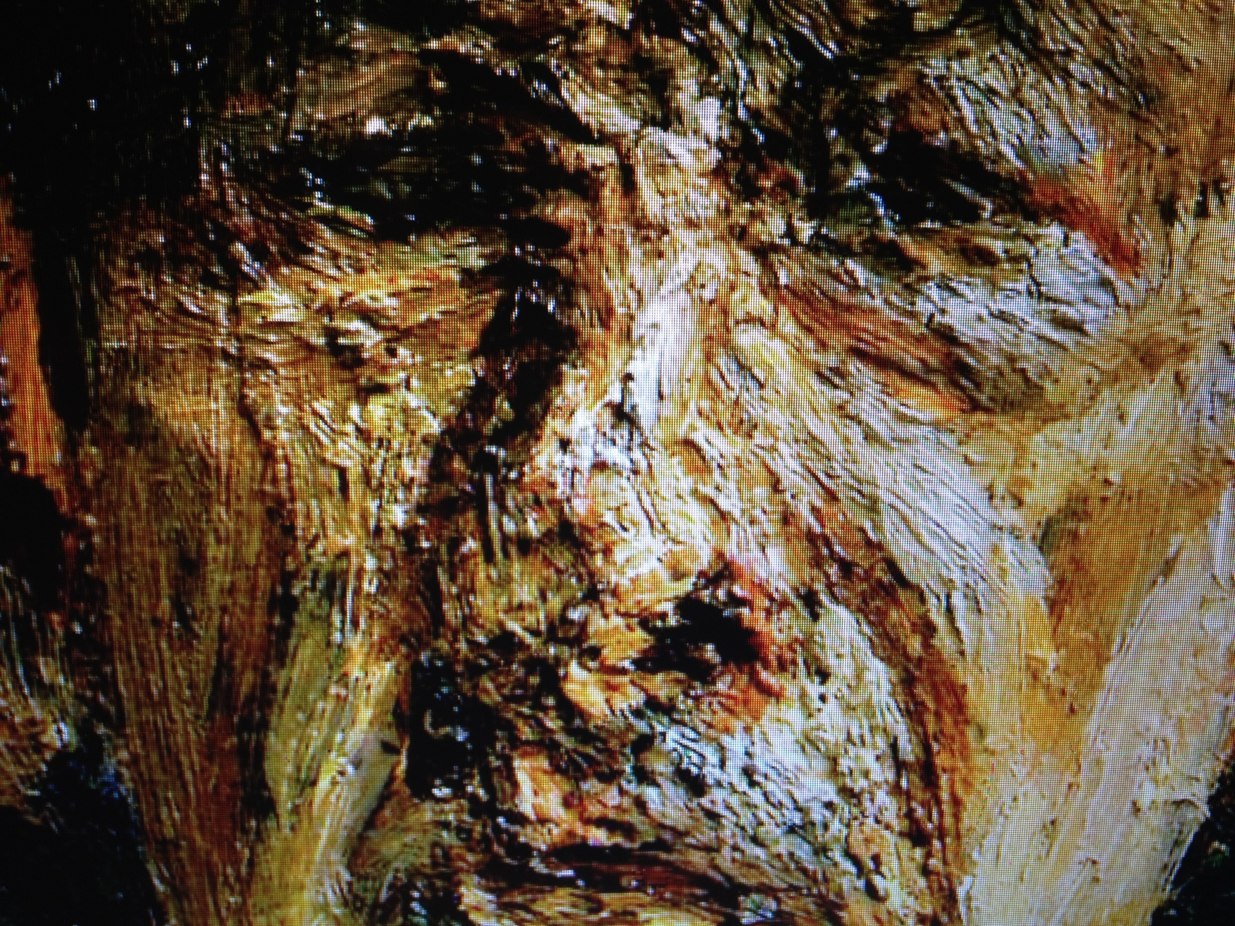
It's crazy - the closer you get, the more abstract the paint becomes. I can't imagine how he could stare intently at someone's mouth, say, then go to the canvas and carve a green slash into a thick layer of paint on it, and yet, from a metre away, it looks exactly perfectly right in tone and texture and everything. Astonishing. And a lot of people talk about the distance between artist and subject, or the odd perspective (he often painted from above) and the inherent anger, but to be honest I didn't necessarily get that. To me it almost makes things more intimate, like he's there, but not necessarily intruding, a bit like Dad coming in and waking you up for school or something. There's a familiarity to it and passion, but I'm not sure anger is the word I'd use.

I also really like the way he does people's foreheads. Quotes below - and they're relevant for all types of artist, writers, singers, painters, the works.

[gallery]

"There is a distinction between fact and truth. Truth has an element of revelation about it. If something is true, it does more than strike one as merely being so."

"I would wish my portraits to be of the people, not like them. Not having a look of the sitter, being them."

"The model should only serve the very private function for the painter of providing the starting point for his excitement. The picture is all he feels about it, all he thinks worth preserving of it, all he invests it with."

"A painter must think of everything he sees as being there entirely for his own use and pleasure."

"Now that I know what I want, I don't have to hold on to it quite so much."

"Painting is sometimes like those recipes where you do all manner of elaborate things to a duck, and then end up putting it on one side and only using the skin."

"Full, saturated colours have an emotional significance I want to avoid."

"The aura given out by a person or object is as much a part of them as their flesh."

"The painter must give a completely free rein to any feeling or sensations he may have and reject nothing to which he is naturally drawn."

"I remember Francis Bacon would say that he felt he was giving art what he thought it previously lacked. With me, it's what Yeats called the fascination with what's difficult. I'm only trying to do what I can't do."

"A painter's tastes must grow out of what so obsesses him in life that he never has to ask himself what it is suitable for him to do in art."

"The subject matter is autobiographical, it's all to do with hope and memory and sensuality and involvement really."

"The longer you look at an object, the more abstract it becomes, and, ironically, the more real."

"I paint people, not because of what they are like, not exactly in spite of what they are like, but how they happen to be."

"What do I ask of a painting? I ask it to astonish, disturb, seduce, convince."

(To Martin Gayford about his portrait) “The picture of you has always been linked in my head with the one of the back end of the skewbald mare."

"I think half the point of painting a picture is that you don't know what will happen. Perhaps if painters did know how it was going to turn out they wouldn't bother actually to do it."

"The only secret I can claim to have is concentration, and that's something that can't be taught."

"I could never put anything into a picture that wasn't actually there in front of me. That would be a pointless lie, a mere bit of artfulness."

"The painting is always done very much with [the model's] co-operation. The problem with painting a nude, of course, is that it deepens the transaction. You can scrap a painting of someone's face and it imperils the sitter's self-esteem less than scrapping a painting of the whole naked body."

"I don't want any colour to be noticeable... I don't want it to operate in the modernist sense as colour, something independent... Full, saturated colours have an emotional significance I want to avoid."

"The aura given out by a person or object is as much a part of them as their flesh. The effect that they make in space is as bound up with them as might be their colour or smell ... Therefore the painter must be as concerned with the air surrounding his subject as with the subject itself. It is through observation and perception of atmosphere that he can register the feeling that he wishes his painting to give out."

"A painter must think of everything he sees as being there entirely for his own use and pleasure."

(On Models) "And, since the model he faithfully copies is not going to be hung up next to the picture, since the picture is going to be there on its own, it is of no interest whether it is an accurate copy of the model."
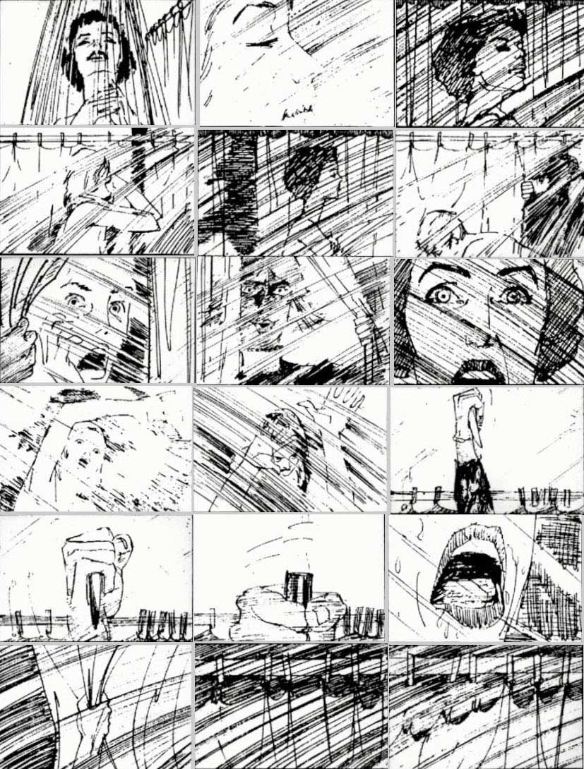
He-gassen - antique Japanese farting competition scroll

You've got your thick-rimmed glasses, your manga books, your expensive jeans and a couple of t-shirts made of really really nice cotton, but do you have a farting scroll?

The database for Japanese and Chinese classics at Waseda University Library has digitised a rare scroll showing a he-gassen (屁合戦), or 'farting competition' (see it here in full).

Apparently, similar drawings were used to ridicule westerners towards the end of the Edo period, with images depicting the westerners blown away by Japanese farts.

Personally, I happen to know first hand that English ones are bad enough, so I'm not sure the Japanese guffs would have worked. My friend Max's divine wind would have made short work of them.

I also once read a book about a dude who travelled the world learning weird local martial arts (pressure points, wrestling, iron jacket, all that stuff), and the weirdest of all was a guy who had deliberately developed halitosis so bad he could knock you out by burping in your face.

Eleven reasons why David Shrigley is my favourite artist (today)

  • According to a piece Dazed did on him (it's here), not only is he a good host, but he wears a seatbelt even when he sits in the back seat.
  • He freely admits that he's shit at drawing and that he's always just drawn like he does. Which is great, actually, because it means he's not putting it on.
  • He mixes humour with art, but still manages to make me think. That said, I don't get all of it.
  • He works pretty constantly - about 30 drawings a day.
  • He's trying to swear less.
  • He said this when drownedinsound asked him if he was worried about overexposure: "“Err… Yes, probably. I don’t know what I’m supposed to do about that though. I suppose to say no to some things, but I don’t know. My criteria is that as long as what I am doing is good then it’s fine to do it. As long as I’m having a good time and I feel what I am doing is interesting and not shite then that’s good and I’m going to continue. I supposed there is a fashion aspect to what I am doing, and perhaps I will go out of fashion at some point. But, again, there’s not a lot I can really do about that so I might as well just… Oh wait, an ambulance is going past.”
  • Apparently he throws away 70% of his drawings
  • Looking at his work, and then at a picture of him, the two don't necessarily go together. That's a good thing.
  • He told The Scotsman that he sometimes he likes to draw people before he meets them for the first time: "The image you have before you meet someone is gone forever as soon as you see them. I like to preserve that image. I like how wrong it is."
  • He did an exhibition at The Serpentine a few years ago, and I bought a book of postcards. Then, when I was ill not long after, loads of people came to visit me and stuff, so I wrote loads of postcards in the book to say thank-you to them. But then I never sent the cards and kept them because I didn't want to part with the art (I still feel a bit guilty about that, but then I've always been crap at writing thank-you letters).
  • Finally, I really really love his stuff. Here's a slideshow. I don't know how to make it go slower, so press stop if you want.
  • [slideshow]

    ps - if you like it, there's loads more on his website, which you can get to by clicking HERE It's much better than the slideshow.

    [youtube=http://www.youtube.com/watch?v=Eyuqk_IeBl8]

    Spaghetti junction

    Cappelletti, cappellacci, tortelli, lasagna, dischi volanti, alfabeto... Inspired by the 1,200 named pasta shapes, designer Caz Hildebrand and chef Jacob Kenedy created a stylish new cookbook that pairs minimalist black-and-white drawings with recipes from London's Bocca di Lupo. The book hopes to give non-Italians a proficiency in the skill of pairing pasta shape and sauces. When you pick it up in paper, The Geometry of Pasta book jacket doubles as a striking fold-out poster. And its website has recipes and an equally impressive guide to pasta shapes.

    Click the image below to go through to the interactive version.

    (via).

    Joris Goulenok

    Brown Paper Bag says: "Joris Goulenok’s lat­est works involve a lot of shapes. They also depict scuf­fles, body builders, and the neigh­bor­hood. I find his work really funny. "Joris pairs shapes, but not in such a way that they cor­re­spond to each other or feel too har­mo­nious. There is the right amount of visual con­flict and ten­sion to keep me inter­ested and look­ing for much longer than a pass­ing glance."

    See more at his Flickr.